How to Use Hypernova Virtualizing WrapPanel Control in a WPF project
Overview
Using VirtualizingWrapPanel Control in a WPF project is very straight forward process. This tutorial will guide you through the process of setting up the Control, to see the core features in action.
Setup the data source
The control is an ItemsPanelTemplate for an ItemsControl, and it pulls its data from the containing (owner/parent) ItemsControl instance.
Simply set up the ItemsSource property of your ItemsControl using the { Binding } infrastructure as you would normally do, and that is all to it.
Code sample:
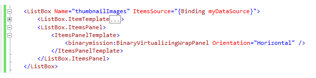
Setup the Control instance in your XAML
Once your items control (say a ListBox) instance is setup (as detailed above), all you will need to do is to setup an instance of VirtualizingWrapPanel control as its ItemsPanelTemplate.
Code sample:
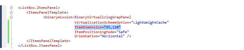
Setup the ItemDimension property in your XAML
The control supports varying values for the Child Item size - i.e. the Height and Width can be different (the item need not be of square shape).
You will need to set this property in the Xaml.
Code sample:
That is all to it! Your ItemsControl UI is now virtualized.
More advanced features that you can setup (all in XAML, no code needed!)
The above described two steps are all that you will need to set up to get the UI virtualization feature up and running for your application.
If you need more advanced features like Grouping, being able to supply custom DataTemplate for Group header section rendering, choosing to optimize on the performance vs. memory footprint, etc. please read on for more features that you can setup, that too all just in XAML (no extra code needed however!).
Grouping, Sorting and Filtering of data in the control
The control supports sorting and filtering out-of-the-box, so you do not need to do anything special in code or XAML to use this feature apart from wrapping your datacontext or the ItemsSource data source with our collection type - VirtualizingCollectionView.
Step 1: Include the control's required namespaces in your code (ViewModel) /XAML like so:
Code sample:

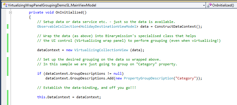
Step 2: Now wrap the data / data context / ItemSource datasource like so:
Here's a sample code block for this setup:
Step 3: Setup some Grouping related properties on the control instance in your Xaml:
You setup the sorting & filtering aspects on your ICollectionView data source as you would normally do, and as long as the data source is setup with that and wrapped with our class VirtualizingCollectionView, the control will transparently work with your ItemsControl data source and render the virtualized children items as per your sorting and/or filtering setup on the data source.
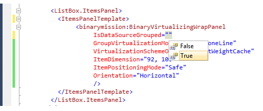
In the XAML, you just indicate that you want to enable the grouping feature (which by default is switched off), by setting up a boolean property IsDataSourceGrouped on the control, like so:
The control supports several styles of rendering the Group header section.
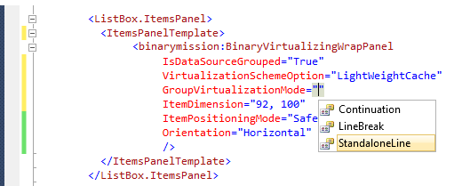
To specify what style of group rendering you want the control to perform, you setup an additional property named GroupVirtualizationMode, like so:
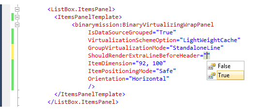
You could also specify if you want a blank line / row / column to be inserted before rendering the group header row with this property ShouldRenderExtraLineBeforeHeader like so:
That is all to it!
There is no extra code/Xaml is needed to enable this feature, apart from the standard code you will have already, say in your ViewModel, to sort and/or group your data source.
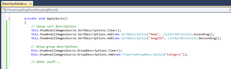
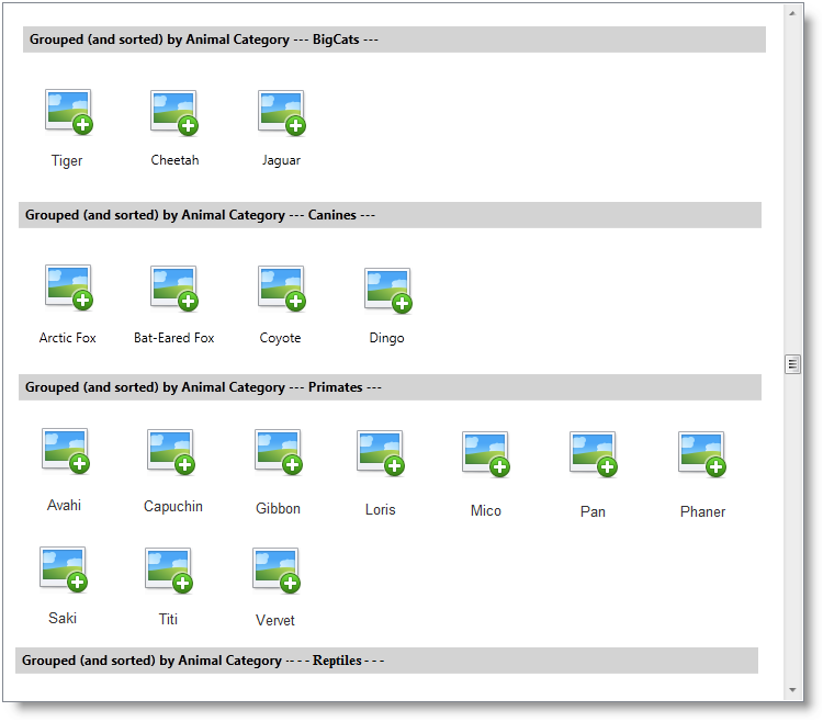
A screenshot of the Sorting & Grouping setup code:
Screenshot of the control rendering its virtualized view based on the Grouping and Sorting setup on the its data source:
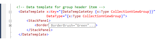
Customizing Group Header section via a custom DataTemplate
The control lets you customize the Group Header section by letting you supply a custom DataTemplate to visualize the group header section.
You setup a custom DataTemplate like so:
A sample custom DataTemplate instance for customizing the Group Header section rendering:
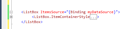
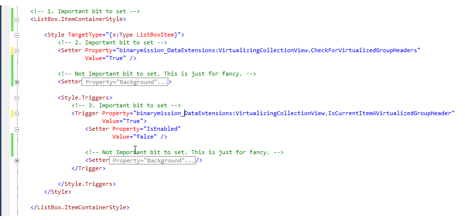
You then setup your ItemsControl's ItemContainerStyle with two specific attached properties from the control like so:
Customizing the Height of the Group Header
By default the control will render the header with a Height of 24.0 units, but you can specify the header height if you are setting up a custom header via your custom data template (as described above).
To support custom height for the header rendering, there is a property in the control named GroupHeaderItemCustomHeight.
You can set this property with a value of your choice, and the control will render the group header nicely accordingly.
This property is a dependency property, so you can even bind to it if your needs are such, but if you know the height of the data template visual right up-front, then simply set that value to this property.
Virtualization schemes
The control supports three virtualization schemes, each one letting you choose-and-pick the best strategy for your application needs, viz., whether to optimize for performance or memory footprint.
This can set up via a dependency property on the control named VirtualizationSchemeOption, like so:
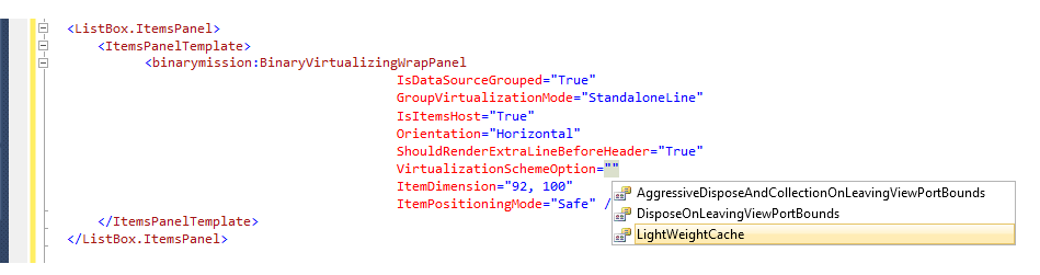
Note that when using the Grouping feature (i.e. IsDataSourceGrouped= True), the VirtualizationSchemeOption only supports LightWeightCache option.
IEditableCollectionView .NET Interface - Support for Transactional updates (Add/Edit/Remove) to the datasource
Transactional view update feature is all about automatically re-rendering the viewport with data based on any transactional add/edit/remove that you may have done to the data source while the control is rendering its children items.
Say for example, you use IEditableCollectionView as your data source, and you update the data while the control has rendered its virtualized children.
Now you want the control to automatically update its render / viewport data with the updated information, without you having to do anything extra in UI or code.
The above Use case is built-into the control out-of-the-box, since the control knows about IEditableCollectionView data source.
This means that when you update your data source - i.e. perform transactional add/remove/edit, the control will automatically refresh, re-virtualize and re-render the updated items in the viewport instantly, without you or your users having to do anything.
For this feature to work, you will need your data source to support IEditableCollectionView interface.
If you are using ListCollectionView as your data source, then you are just fine, since this class implements the IEditableCollectionView, and the control will happily support transactional updates to your data source transparently, without you having to do anything.
Support for Transactional updates (Add/Edit/Remove) to your custom transactional datasource
If you are using a datasource that already implements IEditableCollectionView interface (such as ListCollecctionView, etc.) then you can skip this section, since the control knows about this interface and will do the updates transparently, without you having to do anything extra.
If you have a custom collectionview data source, that does not implement the .NET IEditableCollectionView interface, but implements your own custom transactional updates, then to support your custom transactional updates into the control's viewport, you can use the control's ISupportTransactionalUpdates interface Refresh() method to refresh its viewport with your updates.
In almost 100% of the production applications we have seen so far, transactional updates are done via data sources that implement Microsoft .NET IEditableCollectionView interface, which means you don't have to use our ISupportTransactionUpdates.Refresh() method at all.